Yummygum’s contact form stands out as a strong example of how form design can feel both polished and personal.
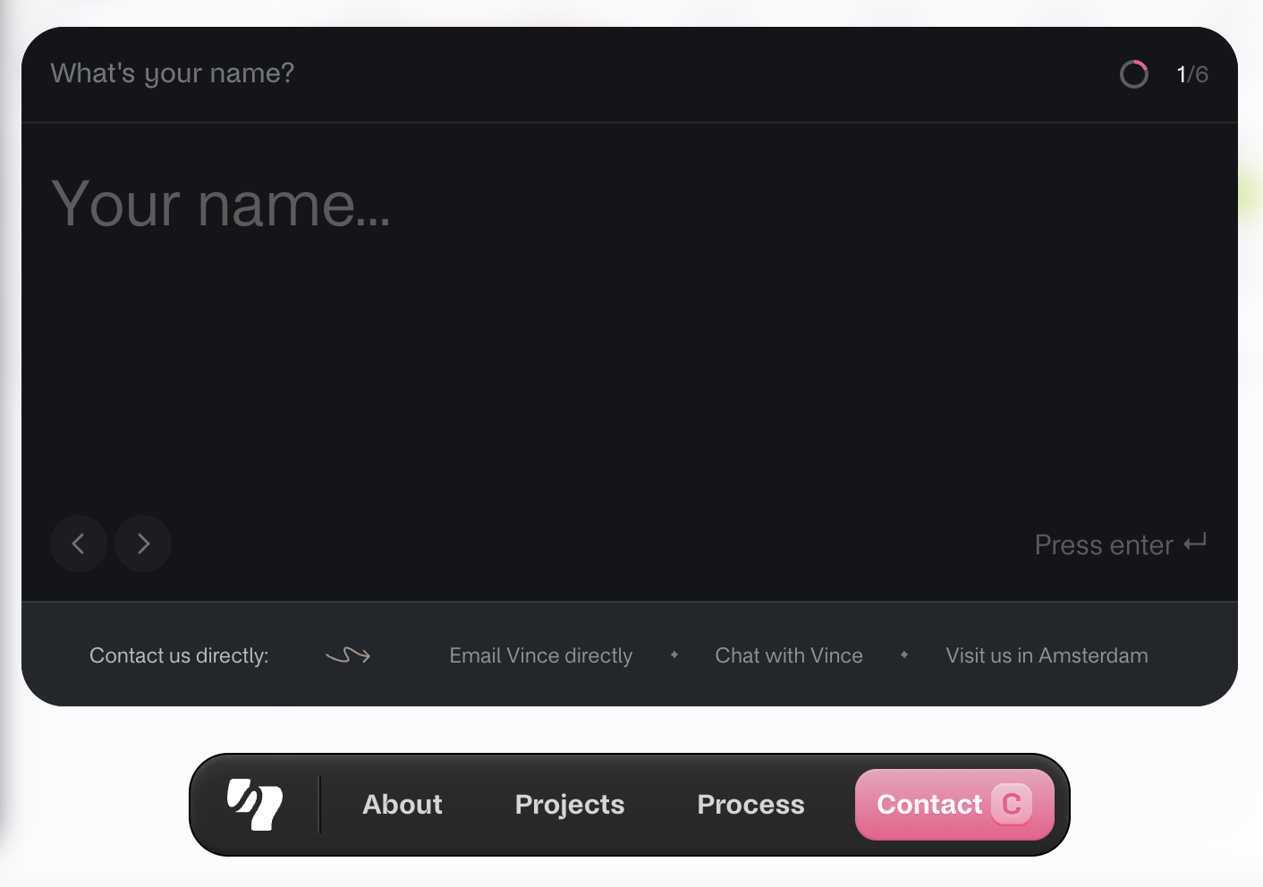
The form takes you through one question at a time in a full-screen, focused interface. Subtle animations, conversational microcopy, and a clean visual hierarchy make the experience feel intentional and frictionless, while optional contact alternatives (like email or chat) add flexibility. Beyond that, a few details are worth noting:
Cloudways’ contact form is a solid example of how to qualify leads without overwhelming the user. Its balanced two-column layout keeps the form compact and easy to scan, even though it includes multiple fields.
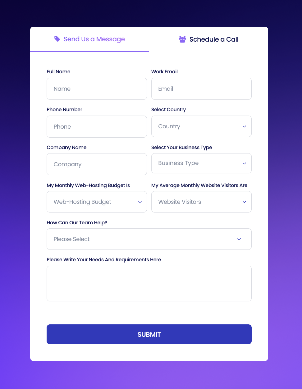
Adding qualifying fields like budget range, business type, and monthly traffic may slightly reduce the total number of submissions, but it significantly improves the quality of incoming leads. From a conversion strategy standpoint, this is a trade-off that favors lead relevance over lead volume. It enables the sales team to prioritize outreach, tailor their messaging, and move faster through the funnel with prospects who are already a better fit.
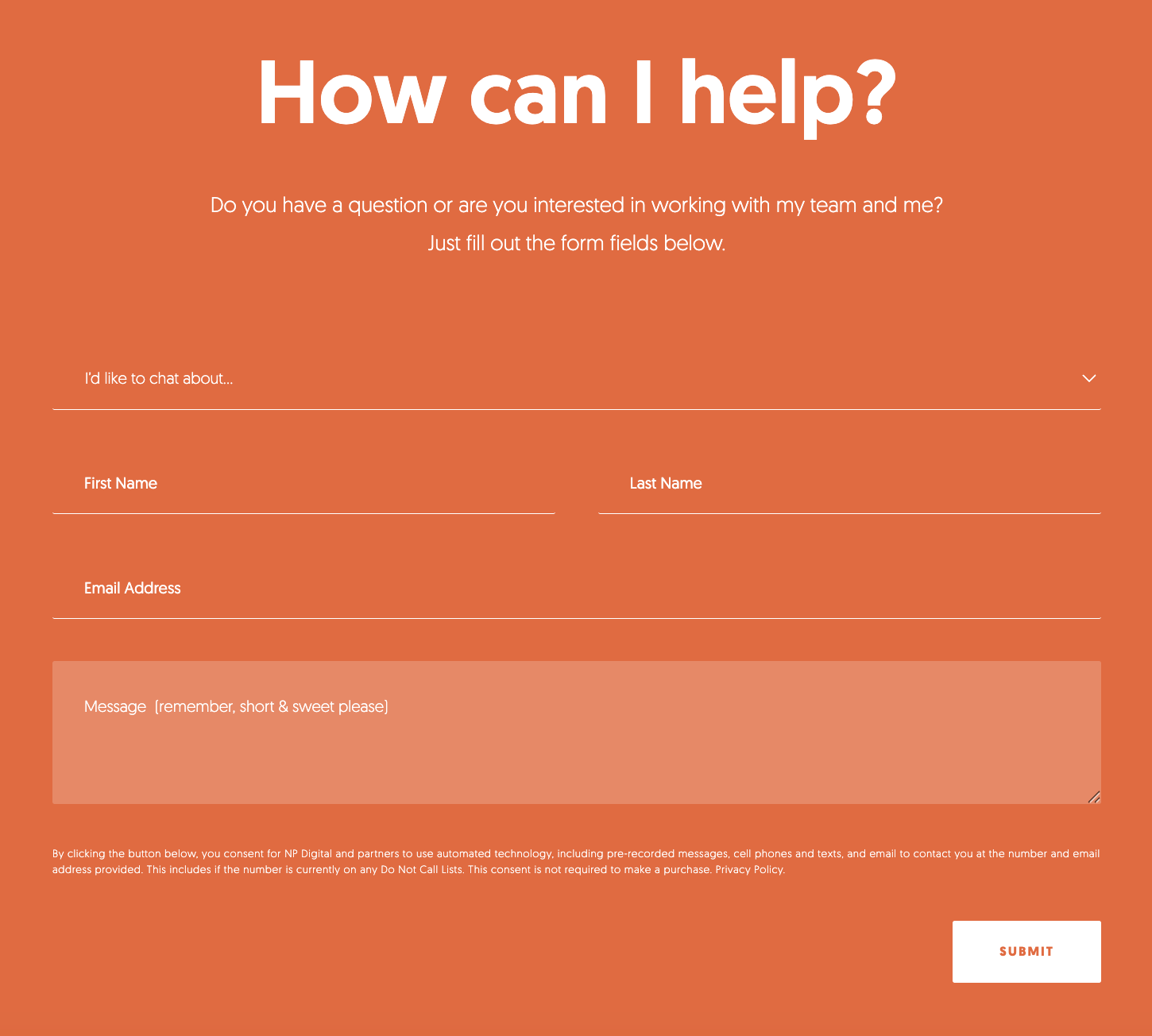
Neil Patel’s contact form is a great example of how simplicity and bold design can combine to create a high-impact user experience. It sticks to just the essentials—topic, name, email, and a short message—which makes it fast and easy to complete. This kind of minimal form works especially well for service-based businesses or personal brands where the goal is to start a conversation rather than collect detailed lead data upfront.
Kinsta’s contact page is a great example of a user-first, multi-channel communication hub. Rather than using a traditional contact form, they present a variety of options—call, chat, email, social media, and even WhatsApp—letting users choose how they want to connect.
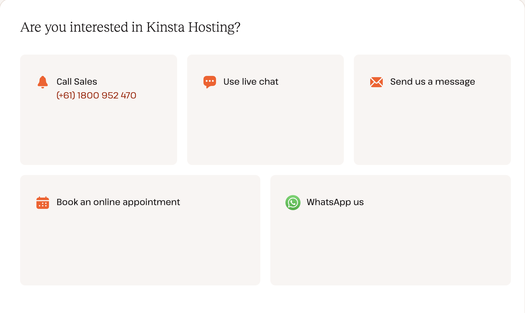
This approach works well for global companies, premium or enterprise-tier platforms where fast, personalized support is expected, or any business serving a diverse audience.
Atlassian’s contact page stands out for its clear, well-organized structure that puts user needs first. It offers multiple resolution paths—some queries link directly to helpful resources or product demos, while others provide a contact button or support ticket form. This layered approach helps users find answers faster while easing the load on support teams.
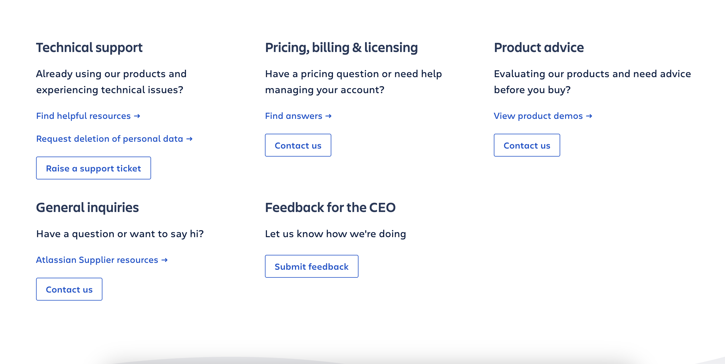
This kind of structure is especially effective for larger product companies or platforms where users have diverse and distinct needs. It helps route requests efficiently and improves both the user experience and internal response times.
The Ban.do contact form is a perfect example of how personality and brand voice can shine through in even the simplest forms. From the playful imagery of pastel rotary phones to the conversational copy (“what you should name your puppy…”), everything feels approachable, human, and on-brand.
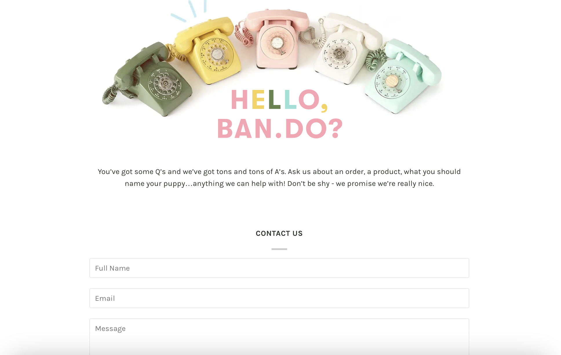
This kind of form works especially well for consumer lifestyle or e-commerce brands where connection and tone matter as much as utility.
What stands out about Focus Lab’s contact form is its intentional simplicity and clarity.
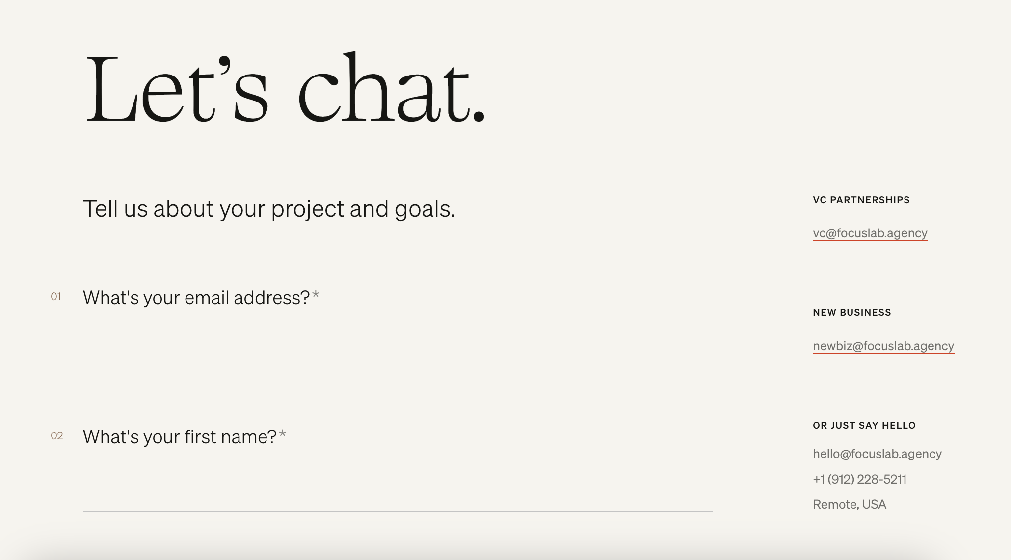
It’s designed specifically for serious project inquiries—there’s no generic “contact us” option, which helps set clear expectations from the start. The clean layout, thoughtful use of whitespace, and refined typography reflect the brand's strong visual identity and build trust instantly. The tone strikes a balance between friendly and professional, creating a welcoming experience without losing its business focus.
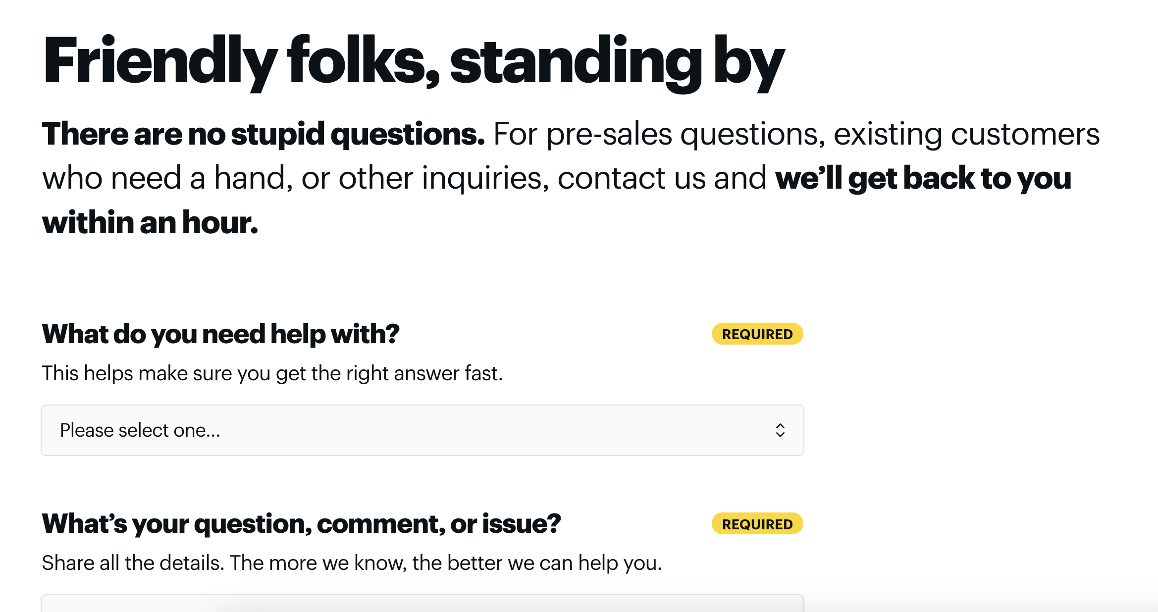
This contact form immediately sets a warm, approachable tone with its friendly header. The bold promise to respond “within an hour” builds trust and shows responsiveness, making it ideal for pre-sales or support inquiries where timing matters. The clear typography, strong contrast, and well-chosen emphasis help important information stand out without overwhelming the user.
A form like this would appeal to customer-centric businesses that prioritize fast and friendly support, and want to make a strong first impression.
The headline “Ready for your Enterprise Plan?” immediately targets high-intent, enterprise-level prospects. The form sits side-by-side with key messaging—compelling stats and a recognizable client logo (Sephora)—to provide context and build trust before the user even starts typing. This layout balances persuasion and action in one view.
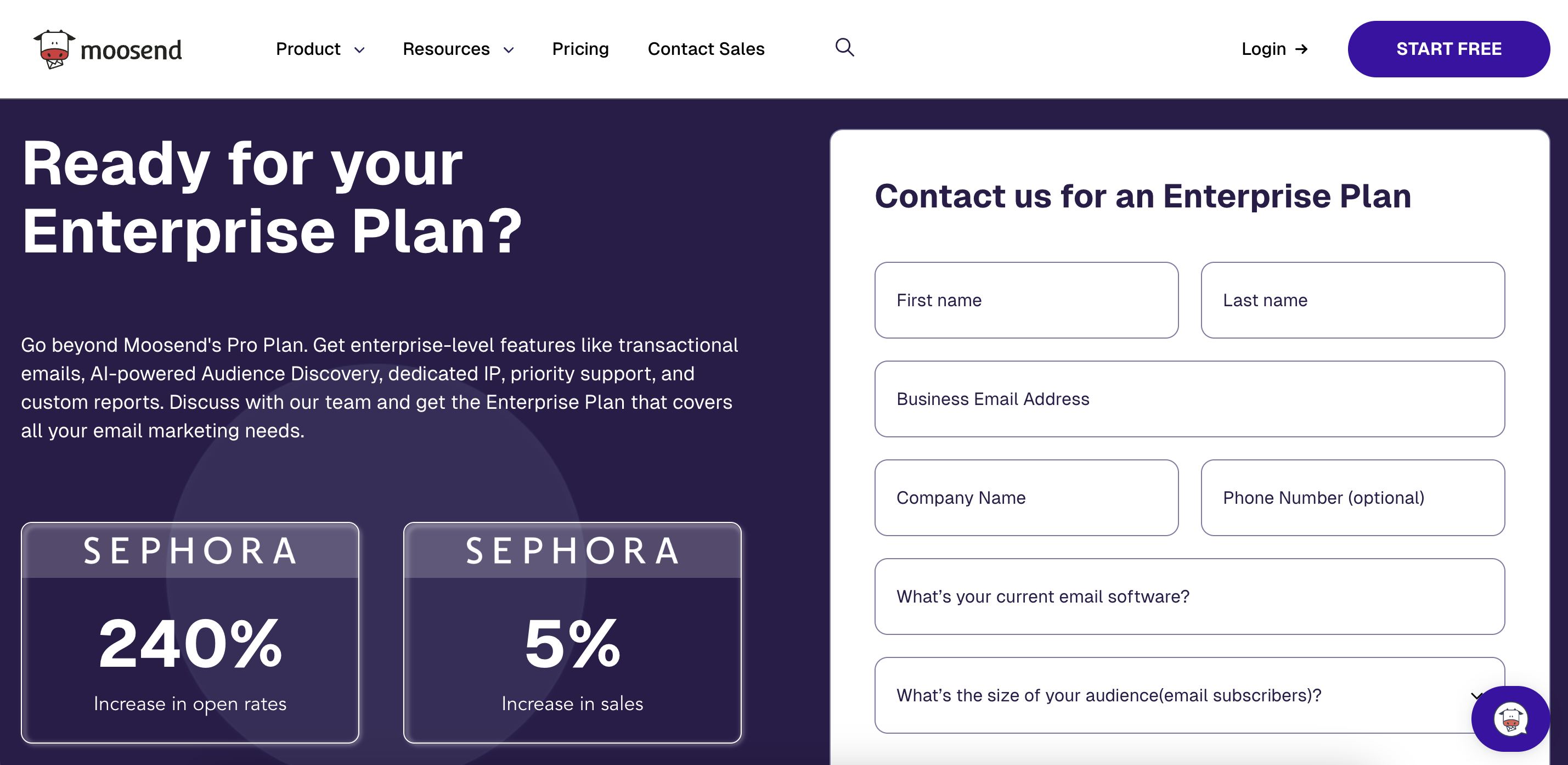
It’s especially effective for SaaS companies with customizable or volume-based enterprise plans, such as marketing automation platforms, CRMs, cloud infrastructure tools, and analytics vendors—any business where pricing and features are tailored case-by-case.
Whether you’re gathering leads, support requests, or just feedback, QuestionScout makes it easy to design, customize, and publish a form in minutes—no coding needed.
Kick off your form with a blank canvas or save time by choosing from a library of ready-made templates. Whether it’s a basic contact form or something more tailored like a feedback or inquiry form, templates help you get started fast and stay focused on what you want to ask.
Create smarter forms by adding one of 15+ specialized field types—from text inputs and dropdowns to file uploads and rating scales. Use conditional logic to show or hide fields based on user responses. Then personalize the look and feel with custom fonts, colors, and layout styles to match your brand.
Stay in the loop with instant email alerts the moment someone fills out your form. You can notify specific team members based on user input, and tailor the confirmation message or thank-you screen your users see after submitting.
Whether you want to share your form as a link or embed it into your website, QuestionScout gives you flexible options. Forms can be shared via URL, email, or social media—Facebook, LinkedIn, Twitter—and embedded directly using a snippet of code. You can even use your own custom domain for a fully branded experience.
Take your forms beyond basic data collection by connecting them to your existing tools and workflows. With integrations like Zapier, Pabbly, and Integrately, you can automatically send responses to other apps, trigger follow-up emails, or update your CRM. Track performance with Google Analytics or similar tools. You can also enable payments using providers like Stripe, PayPal, Square, and more—charging fixed rates or adjusting prices based on user selections. It’s ideal for forms that need to do more, from lead capture to full checkout.